
Project Type: Concept
My role: Naming, Visual Identity
This concept brand targets users who utilize soundscapes and binaural beats to cultivate flow states.
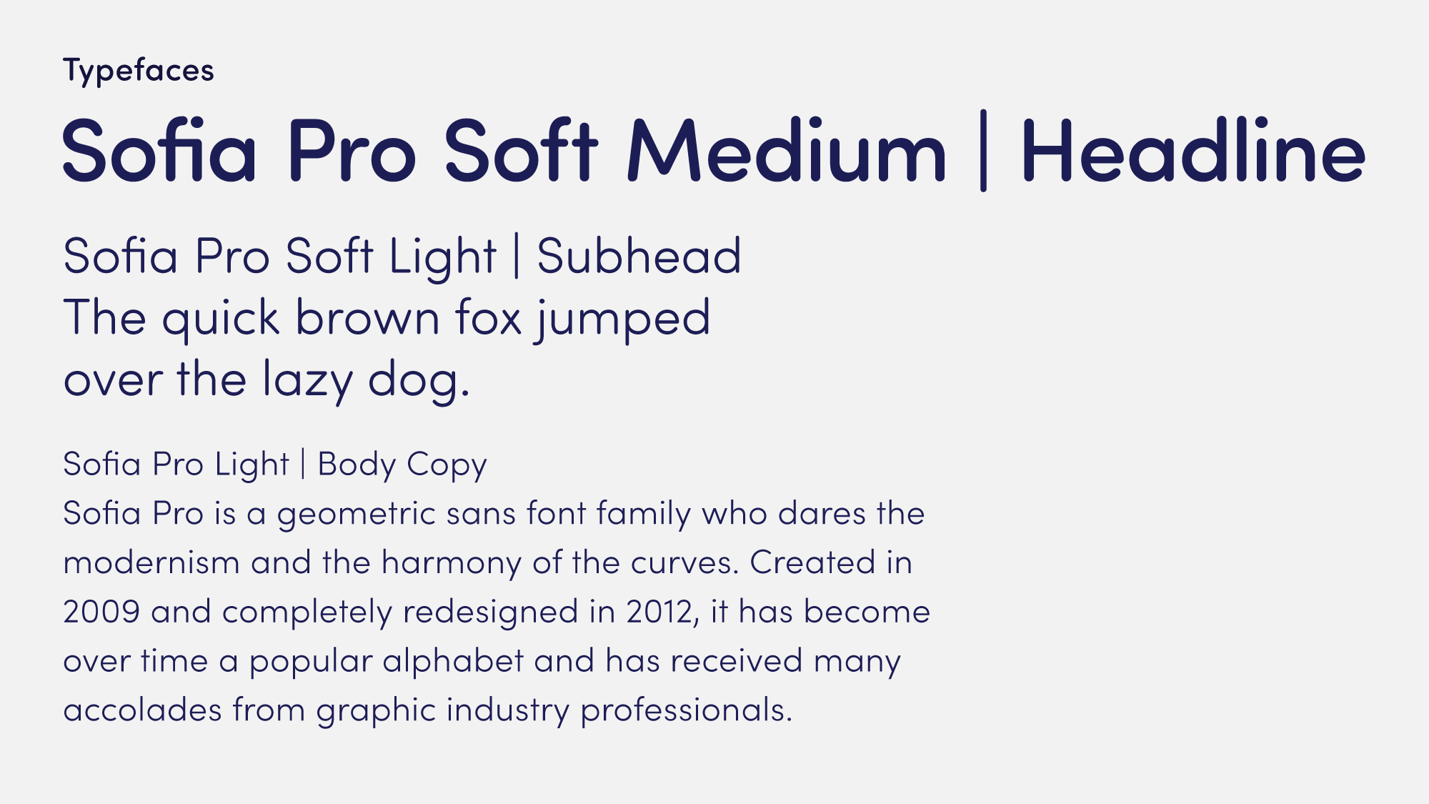
The brand strategy centers on intentional simplicity—clean typography, purposeful white space, and a focused color system that eliminates cognitive load while supporting users' pursuit of focus, meditation, and sleep. Three distinct colors correspond to these core use cases, functioning as both intuitive wayfinding and user personalization within a systematically restrained visual approach.
The wordmark's baseline mimics both an audio waveform and the natural rhythm of saying "Cadence," reinforcing the brand's connection to sound and rhythm. The embedded ear icon provides flexible application across touchpoints where the full wordmark won't fit.


